Using CSS to make your web pages pretty
After the previous lesson you should be able to select pretty much anything you want to in any given HTML page. This is really useful, as it is how styles are applied to elements in 95% of web sites (the only exceptions being some JavaScript frameworks).
Do you remember what we said in Part 1 about the separation of concerns? That it's really useful to be able to separate out our content from our styles?
Take a look at the following 2 websites:
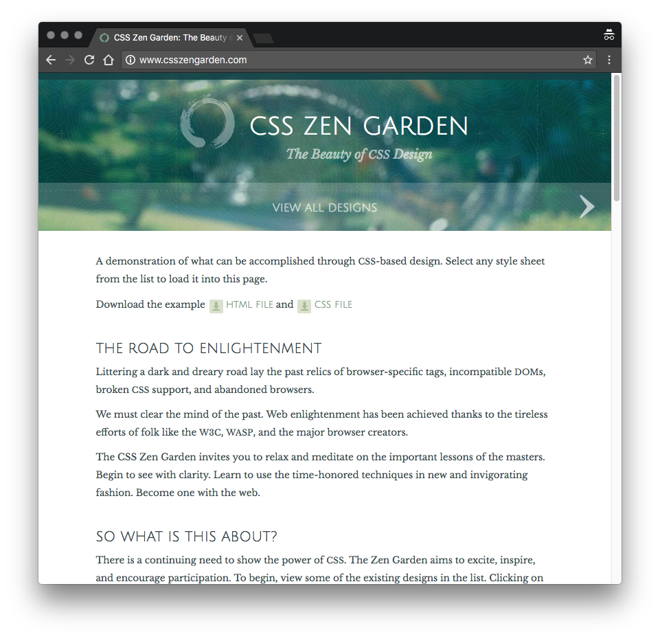
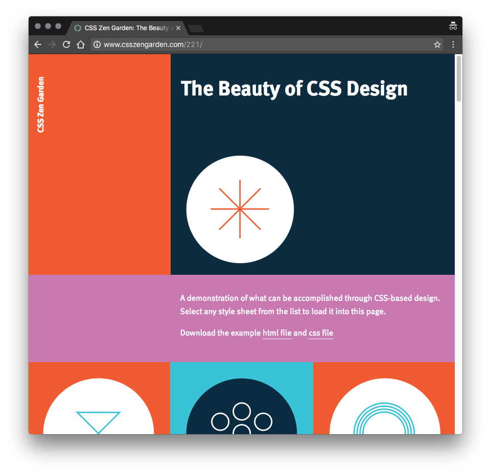
What do you notice about them?
If you're looking carefully you'll notice that the content is identical, because they are in fact the exact same HTML, just with a different style sheet applied.
The website is called CSS Zen Garden and it is a collection of a lot of different stylesheets that can all be applied to the exact same HTML! Just by changing the stylesheet we can entirely change the website's look and feel.
So now we can select basically any element on our page, what kinds of styles can we apply?
Display and positioning
In this section, we'll be discussing how to control the display and positioning of elements on a web page using CSS. We'll be covering the different display values, the position property, and the float property. Additionally, we will also be exploring the use of flexbox for layout.
Display values
All HTML elements have a default display value that determines how they are rendered on the page. Each element can have a different type and every element starts with a 'default' type. The most commonly used display values are:
- inline: elements are rendered inline, which means they take up only as much width as necessary and do not create a new line after them.
- block: elements are rendered as blocks, which means they take up the full width of their parent container and create a new line after them.
- inline-block: elements are rendered inline, but can have a set width and height.
- none: elements are not rendered at all.
Block elements are elements that take up the full width of their parent container and create a new line after them. Examples of commonly used block elements in CSS include:
divh1-h6(heading tags)p(paragraph tag)olandul(ordered and unordered lists)formheaderandfootersectionarticleasidenav
Inline elements are elements that are rendered inline, which means they take up only as much width as necessary and do not create a new line after them. Examples of commonly used inline elements in CSS include:
a(anchor tag)spanstrongandem(bold and italic)img(image tag)
Inline-block elements are elements that are rendered inline, but can have a set width and height. Examples of commonly used inline-block elements in CSS include:
buttoninputselectlabel
By changing the display property on an element, you can change the default display value of that element. For example, you can make a div display as an inline-block element by using the following CSS:
div {
    display: inline-block;
}-
Create a new HTML file and add a div element with an id of "box" and a p element inside.
<div id="box"> <p>This is a block element</p> </div> -
In your CSS file, set the width and height of the div to 200px and 100px respectively, and add a background color of your choice.
#box { width: 200px; height: 100px; background-color: yellow; } -
Now, run the HTML file in your browser and observe the size of the div.
-
Now, change the display property of the div to "inline" in the CSS file and refresh the browser. Observe the size of the div and compare it to the previous one.
The Position Property
The position property is used to control the position of elements on a web page. The position property can be set to one of four values:
- static: elements are rendered in the normal flow of the document, and do not have a specific position. This is the default value for all elements.
- relative: elements are positioned relative to their normal position in the flow of the document. The top, right, bottom, and left properties can be used to adjust the position of the element.
- absolute: elements are positioned relative to their nearest positioned ancestor (instead of the viewport, like fixed position). The top, right, bottom, and left properties can be used to adjust the position of the element.
- fixed: elements are positioned relative to the viewport, and do not move when the page is scrolled. The top, right, bottom, and left properties can be used to adjust the position of the element.
#box {
  position: relative; /* #box will be positioned relative to its normal position in the flow of the document */
  top: 50px;
  left: 25px;
}
Understanding position is a bit tricky, but the basic principles are this:
- All block elements are, by default, set to
position: static. This means they are in the flow of the rest of the elements of the page (ie. if you add things before them or around them, they move around and flow to accommodate them). - The
positionproperty has 3 other possible values:absolute,relativeandfixed. - In any of these other states, you can use the position properties
top,left,bottom, andrighton the object. - When the position is
relative, the object will move relative to where it would normally have been in the page. - When the position is
absolute, the object moves based upon its nearest parent with position not set to static. It is removed from the flow of the page, so other elements behave like it doesn't exist. - When the position is
fixed, the object is positioned relative to the browesr window (ie. it doesn't follow the page when we scroll like elements usually do). It is removed from the flow of the page.
The best way to understand this, is to try it out for yourself. Take the following HTML:
Copy the following text:
<p>The best taco bowls are made in Trump Tower Grill. I love Hispanics! He’s not a word hero. He’s a word hero because he was captured. I like text that wasn’t captured. You have so many different things placeholder text has to be able to do, and I don't believe Lorem Ipsum has the stamina. He’s not a word hero. He’s a word hero because he was captured. I like text that wasn’t captured.</p>

<div class="block">
  This is the block of text that will sit in the page
</div>

<p>When other websites give you text, they’re not sending the best. They’re not sending you, they’re sending words that have lots of problems and they’re bringing those problems with us. They’re bringing mistakes. They’re bringing misspellings. They’re typists… And some, I assume, are good words. You’re disgusting. If Trump Ipsum weren’t my own words, perhaps I’d be dating it.</p>

<p>Some people have an ability to write placeholder text... It's an art you're basically born with. You either have it or you don't. Trump Ipsum is calling for a total and complete shutdown of Muslim text entering your website.</p>

<p>Some people have an ability to write placeholder text... It's an art you're basically born with. You either have it or you don't. Be careful, or I will spill the beans on your placeholder text.</p>
And add the CSS:
.block {
  background-color: blue;
  top: 40px;
  left: 40px;
}
Now add position: relative and refresh. What has happened? Do you see how the page still behaves as though the element was in its original place, but the element has visually moved down (from the top) and right (from the left) by 15px each?
Now change it to position: absolute and refresh. What happened? The element now is completely removed from the flow of the page, and has positioned itself 15px away from the top and left of the body element (aka the page).
Now switch to position: fixed and resize your window so you have to scroll a bit. What happens?
Check out the video below for a quick demo of using the position attribute and how it affects the display of block elements.
The Float Property
The float property is used to float elements to the left or right of their parent container. The most common use of the float property is to move images or boxes to float left or right inside a column of text.
.left {
  float: left; /* elements with the class "left" will be floated to the left of their parent container */
}

.right {
  float: right; /* elements with the class "right" will be floated to the right of their parent container */
}
When an image is set to float, it will be taken out of the normal flow of the document and positioned either to the left or right of the surrounding text.
When an image is floated to the left, the text will flow around it on the right side. Similarly, when an image is floated to the right, the text will flow around it on the left side. This creates an effect known as "text wrapping" and it is commonly used to have images and text side by side.
Additionally, it's important to note that when an image is floated, it will also cause elements that come after it to be affected by the float. For example, if a block element follows a floated image, it will be positioned next to the image rather than below it. This is because the block element is also taken out of the normal flow of the document and positioned relative to the floated image.
It's also worth noting that if you want to return an image to the normal flow of the document, you can use the clear property. This property allows you to specify whether an element should be positioned above or below floated elements. For example, to make an element clear both left and right floated elements you would use the following css:
#clear-element {
    clear: both;
}
It's important to be aware that the float property has some layout implications, using it too much or not using the clear property can cause layout problems like overlapping elements or elements not being where they are supposed to be.
Flexbox
Flexbox is a CSS layout module that makes it easy to create flexible, responsive layouts. It allows you to align items in a row or column and distribute the remaining space between them. It can be used to create flexible grids and can also be used for vertical alignment. For example:
.container {
  display: flex; /* elements with the class "container" will be displayed as flex elements */
  flex-wrap: wrap; /* elements will wrap to the next row */
}

.item {
  flex: 1; /* each item will take up an equal amount of space */
}
Flex container
To create a flex container, you need to set the display property of the parent element to flex. For example:
.container {
  display: flex;
}
Any children of this container will now arrange themselves in a row from left to right (the default)
Flex items can be aligned in either a row (horizontally) or a column (vertically). You can control the flex direction using the flex-direction property. The default value is row.
.container {
    flex-direction: row; /* align items horizontally (default) */
}

.container {
    flex-direction: column; /* align items vertically */
}
Flex items can be wrapped onto multiple lines in case the flex container is not wide enough to fit all the items on a single line. You can control the flex wrap using the flex-wrap property. The default value is nowrap.
.container {
    flex-wrap: nowrap; /* items will not wrap (default) */
}

.container {
    flex-wrap: wrap; /* items will wrap to the next line */
}
Justifying Items
Flex items can be aligned horizontally within the flex container using the justify-content property. There are several values you can use to align items:
- flex-start: align items to the start of the container (left for rows, top for columns)
- flex-end: align items to the end of the container (right for rows, bottom for columns)
- center: align items in the center of the container
- space-between: distribute items evenly along the main axis (with equal space between them)
- space-around: distribute items evenly along the main axis (with equal space around them)
Using the justify-content property will align or justify items inside the flex container, along the flex axis. That means if you are using flex-direction: row, the items will be justified horizontally. If you switch the flex-direction to column, the items will be arranged and justified vertically.
.container {
    justify-content: flex-start; /* align items to the start of the container (default) */
}

.container {
    justify-content: center; /* align items in the center of the container */
}

.container {
    justify-content: space-between; /* distribute items evenly along the main axis with equal space between them */
}
Aligning items
Flex items can be aligned vertically within the flex container using the align-items property. There are several values you can use to align items:
- flex-start: align items to the start of the container (top for rows, left for columns)
- flex-end: align items to the end of the container (bottom for rows, right for columns)
- center: align items in the center of the container
- baseline: align items to their baselines
- stretch: stretch items to fill the container
Note that align-items works in the perpendicular direction to the direction of the flex. So if your flex container is set to flex-direction: row then your items can be aligned vertically using the align-items property.
.container {
    align-items: flex-start; /* align items to the start of the container (default) */
}

.container {
    align-items: center; /* align items in the center of the container */
}

.container {
    align-items: stretch; /* stretch items to fill the container */
}
Controling the size of individual flex items
You can control the size and alignment of individual flex items using the following properties:
- flex-grow: defines how much a flex item should grow relative to the other items in the flex container. A value of 0 means the item will not grow, while a value of 1 means it will take up all the remaining space. Values other than 0 or 1 are used relative to each other – so a flex item with flex-grow: 2 will grow twice as much as an item with flex-grow: 1.
- flex-shrink: defines how much a flex item should shrink relative to the other items in the flex container. A value of 0 means the item will not shrink, while a value of 1 means it will shrink as much as necessary.
- flex-basis: defines the initial size of a flex item before any growing or shrinking is applied. It can be a length value (e.g. 50px), a percentage value (e.g. 20% which would be 20% of the flex container), or the keyword "auto" (default value).
These properties are consolidated in a single short-hand property: flex.
The flex shorthand property is a shorthand property that allows you to set the flex-grow, flex-shrink, and flex-basis properties of an element in a single line of CSS. It can be used to set the size and alignment of individual flex items within a flex container.
.item {
    flex: <flex-grow><flex-shrink><flex-basis>;
}
For example, the following code will set the flex-grow to 1, flex-shrink to 2, and flex-basis to 50px:
.item {
    flex: 1 2 50px;
}
It's worth noting that you can also use the flex shorthand property with only one or two values. If you use only one value, it will be assigned to flex-grow and flex-basis will be set to "auto". If you use two values, the first one will be assigned to flex-grow and the second one to flex-shrink, and flex-basis will be set to "auto"
.item {
    flex: 1; /* equivalent to flex: 1 1 auto; */
}

.item {
    flex: 1 2; /* equivalent to flex: 1 2 auto; */
}
Using the flex shorthand property can make your code more concise and easy to read, allowing you to set the size and alignment of flex items quickly and efficiently.
You can use these properties in combination to create different types of layouts. Flexbox is a powerful and flexible layout tool, and it can be used to create many different types of responsive and adaptive layouts.
For example, you can use flexbox to create a simple grid layout, where items are arranged in a row and their width adapts to the size of the viewport.
<div class="container">
    <div class="item"></div>
    <div class="item"></div>
    <div class="item"></div>
</div>
.container {
display: flex;
flex-wrap: wrap;
}
.item {
flex: 1;
}In this layout, each item will be automatically sized compared to it's content (flex-basis: auto) and will then expand equally to fill the row on any screen. If required, items will wrap to a new line to fit.
Another example is creating a navigation bar, where the items are aligned horizontally and take up equal space
<div class="container">
    <a href="#" class="item">Home</a>
    <a href="#" class="item">About</a>
    <a href="#" class="item">Contact</a>
</div>
.container {
display: flex;
justify-content: space-between;
}
.item {
flex: 1;
}These are just a few examples of the many different layouts that can be created using flexbox. It's a powerful tool that can make your layout process more efficient and flexible, allowing you to create responsive and adaptive layouts with ease.
The Box Model
In this module, we'll be diving into one of the most fundamental concepts in CSS: the box model. Understanding the box model is crucial to effectively styling and layout web pages, so let's get started!
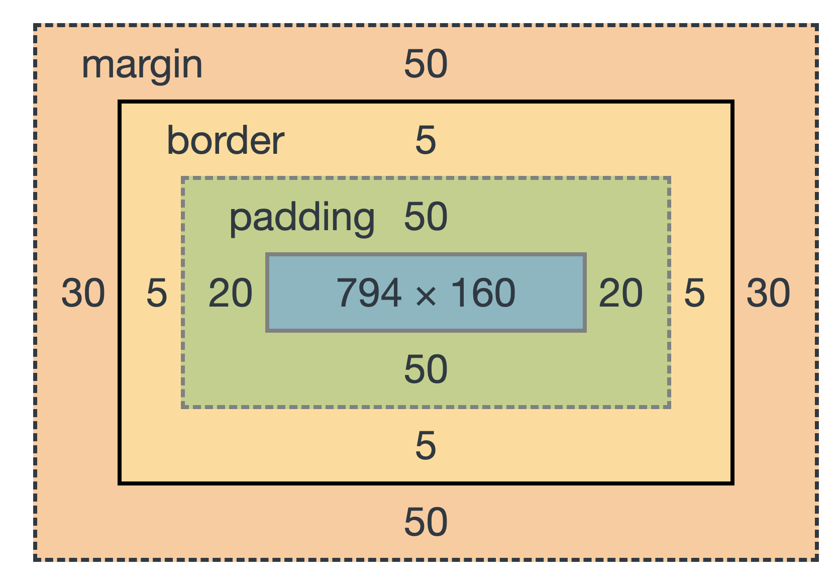
The box model is the concept in CSS that defines the layout of elements on a web page. Every HTML element is considered to be a rectangular box, and the box model defines how the size and position of these boxes are determined. The box model consists of four parts: content, padding, border, and margin.
- Content: The content area of an element is where the actual content of the element is displayed. For example, if an element contains text, the content area is where that text will be displayed. The width and height of the content area can be set using the width and height properties.
- Padding: Padding is the space between the content of an element and its border. Padding can be set using the padding property, and can be set for all four sides of the element or for individual sides. For example, padding-top, padding-right, padding-bottom and padding-left.
- Border: The border is the line that surrounds the padding and content of an element. The border can be set using the border property, and can be set for all four sides of the element or for individual sides. The border property can accept one, two or three values, the width, style, and color.
- Margin: Margin is the space between the border of an element and the other elements or the edges of the web page. Margin can be set using the margin property, and can be set for all four sides of the element or for individual sides. For example, margin-top, margin-right, margin-bottom, and margin-left.
Below is a diagram of the box model of a DIV that is 794px wide and 160px high, with 20px of padding, 5px of border and 50px/30px of margin.
Content
The width and height of the content area of an element can be set using the width and height properties. The width and height properties set the size of the content area, not including padding, borders, or margins. For example:
div {
    width: 300px;
    height: 200px;
}
This will set the content area of the div to be 300 pixels wide and 200 pixels tall.
When setting the width and height of an element, it's important to keep in mind that these properties set the minimum size of the content area. The min-width and min-height properties, on the other hand, set the minimum size of the entire box, including padding, borders, and margins.
We can set the height and width of a block element in CSS using the height and width properties.
.navigation {
  background-color:  #e0e0e0; /* just so we can see the box */
  height: 100px;
  width:  150px;
}
Try this code out. What happens?
How about if you use a % instead of px ?
height and width will try and set the height and width of our box, but sometimes the content inside the box is too big to fit. In this case we will see the text overflow outside the element.
Try setting a really small height and width and see what happens.
We can stop this happening by setting overflow: hidden; on the box.
Try this now.
We can also set dynamic height and width (the defaults in fact) by using height: auto; or width: auto;. In this case the box will take up 100% of the screen width (by default) and the height will adjust to the content.
Finally, we can also use min-height and max-height, and the same for width, in order to define a minimum and maximum height. This have priority over height and width so if an element has min-height: 100px; height: 80px; it will still be rendered 100px high.
Padding
Padding is the space between the content of an element and its border. Padding can be set using the padding property, and can be set for all four sides of the element or for individual sides. For example:
div {
    padding: 10px; /* sets padding for all four sides */
}
div {
padding-top: 10px;
padding-right: 15px;
padding-bottom: 20px;
padding-left: 25px; /* sets padding for individual sides */
}This will set the padding for all four sides of the div to 10px, 15px, 20px, and 25px respectively.
It's important to note that when padding is added to an element, it increases the size of the element, pushing other elements away. This is different from margins, which do not affect the size of an element, but rather the space between elements.
There is also a shorthand property for padding:
padding: 10px;This will apply 10px padding to all sides of the element.
padding: 5px 10px 20px 10px;This will apply top padding of 5px, right padding of 10px, bottom padding of 20px and left padding of 10px.
The order is important, as the padding property expects the paddings to come in this order (that is, in the order of compass points, N E S W).
Border
The border is the line that surrounds the padding and content of an element. The border can be set using the border property, and can be set for all four sides of the element or for individual sides. The border property can accept one, two or three values, the width, style, and color. For example:
div {
    border: 2px solid black; /* sets 2px wide solid black border for all four sides */
}
div {
border-top: 2px solid black;
border-right: 3px dotted blue;
border-bottom: 4px dashed red;
border-left: 5px double green; /* sets individual border styles for each side */
}This will set the border of the div to be 2px wide, solid and black for the top, 3px wide, dotted and blue for the right, 4px wide, dashed and red for the bottom, and 5px wide, double and green for the left.
The border style can be set to solid, dotted, dashed, double, groove, ridge, inset, or outset.
Try out the following CSS :
.navigation {
  border-width: 1px;
  border-color: black;
  border-style: solid;
}
Do you see the border around your navigation element?
Try out some other border styles and colors.
Instead of writing out :
.navigation {
  border-width: 1px;
  border-color: black;
  border-style: solid;
}
We can just write :
.navigation {
  border: 1px solid black;
}
These are called short-hand properties, and they allow us to be more efficient when writing CSS.
The border shorthand property is a shorthand property that allows you to set the width, style, and color of an element's border in a single line of CSS. It can be used to set the border of any HTML element, including divs, paragraphs, images, and more.
It's worth noting that you can also use the border shorthand property with only one or two values. If you use only one value, it will be assigned to the width and style will be set to "solid" and color will be set to "black". If you use two values, the first one will be assigned to width and the second one to style. Color will be set to "black".
element {
    border: 2px; /* equivalent to border: 2px solid black; */
}

element {
    border: 2px dotted; /* equivalent to border: 2px dotted black; */
}
Margin
Margin is the space between the border of an element and the other elements or the edges of the web page. Margin can be set using the margin property, and can be set for all four sides of the element or for individual sides. For example:
div {
    margin: 10px; /* sets margin for all four sides */
}
div {
margin-top: 10px;
margin-right: 15px;
margin-bottom: 20px;
margin-left: 25px; /* sets margin for individual sides */
}It's important to note that when setting the margin property, a value of auto can be used to center an element horizontally within its parent container.
Create an HTML document or reuse one your already have. Edit or HTML and CSS and have a look and see what happens when:
- You use a negative number for the left padding.
- You use a negative number for the top padding.
- You use percentages for the padding instead of pixels
- You set 'margin-left' and 'margin-right' to
auto.
Box Sizing
The box-sizing property is used to include padding and border in the total width and height of an element. By default, the box-sizing property is set to content-box, which means that the width and height of an element only includes the content area, not the padding or border. However, by setting the box-sizing property to border-box, the width and height of an element will include the content, padding, and border. For example:
div {
    box-sizing: border-box;
}- Create a new HTML file and add a div element with an id of "box".
- In your CSS file, set the width and height of the div to 200px and 100px respectively, and add a background color of your choice. Also, add a border with a width of 2px and a color of your choice.
- Now, add padding of 20px to all sides of the div.
- Next, add margin of 30px to all sides of the div.
- Now, run the HTML file in your browser and observe the size of the div.
- Now, change the box-sizing property of the div to border-box and refresh the browser. Observe the size of the div and compare it to the previous one.
The box-sizing property allows you to include the padding and border in the total width and height of an element. By default, it is set to "content-box" which means that the width and height of an element only includes the content area, not the padding or border. However, by setting the box-sizing property to "border-box", the width and height of an element will include the content, padding, and border.
Styling Block Elements
One of the most important parts of CSS when designing a web page is box styling.
Box styling basically has 5 main parts:
- Backgrounds
- Box size
- Padding
- Margins
- Borders
We saw how the padding, margins and borders allow us to change the size and shape of boxes.
Let's look at backgrounds.
Backgrounds
When it comes to styling backgrounds of block elements, you have a few options to choose from. One of the most popular options is using images. You can use a background image to give your elements some personality and make them stand out. To use an image as a background, you'll need to use the background-image property. You can also use the background-repeat, background-size, and background-position properties to control how the image is displayed.
Another option you have is using gradients. Gradients are a great way to add a subtle touch of color to your elements. They can be used to create a sense of depth or movement. There are two types of gradients, linear and radial. Linear gradients go from one color to another in a straight line, while radial gradients go from one color to another in a circular pattern. To use gradients, you'll need to use the background-image property with a value of linear-gradient or radial-gradient, followed by the colors and direction you want to use.
Finally, you can also use plain color for styling the backgrounds. It's the simplest and most straightforward way of styling the background of an element. You can use the background-color property and give it a color value, whether it's a named color or a hex value.
So, whether you want to use an image, gradient, or color, there's a property that will help you achieve the desired look and feel of your element's background. Have fun experimenting with different options and see what works best for your design.
Copy the following code to an HTML file and open it in your browser:
<nav class="navigation"><a href="/html/">HTML</a> |
  <a href="/css/">CSS</a> |
  <a href="/js/">JavaScript</a> |
  <a href="/jquery/">jQuery</a>
</nav>
Now apply the following CSS (either in the head or in an external style sheet, your choice).
.navigation {
  background-color: #e0e0e0;
}
Notice that the nav box now gets a nice gray background.
We can change the background-color of elements using background-color.
We can also use background-image: url('/images/myimage.png') to add backgrounds, and we can use the properties background-repeat, background-position and background-size to modify the repeat, position and size of the background images.
If you want to learn more about backgrounds, you can complete the following tutorial which covers the basics:
Styling Text
Now let's take a look at the different things we can do with text in CSS.
The CSS properties affecting text display can fall into two large categories:
- Font Styles which are properties that affect the font that is applied to the text, affecting what font is applied, its size and shape and any styling effects (such as bold or italics) that are applied.
- Text layout styles which are properties that affect the spacing, layout and other features of the text, allowing us to manipulate the space between lines and letters and how the text is aligned.
You should remember that all the text within an element will be affected by any style you apply to that element. To style specific parts of the text in an element (for example just one word, or just one letter) you need to wrap that part of text in HTML such as a <span>.
Fonts
The first thing to remember in HTML is that by default in your websites you can only use Fonts that your user has installed on their machine. That means, if you want to use a nice fancy new font you just found for your CV, your user needs to have that same font installed on their computer already, otherwise they will just see plain text in a default font such as Helvetica, Arial or Times New Roman.
Web safe fonts
Back in the olden days of the web (like... before 2005) web designers were limited to using what we call Web Safe Fonts. These are fonts that we can be sure are installed on pretty much every computer that will be accessing the web. I'm sure you'll recognize most of them:
- Arial, a sans-serif font, very similar to Helvetica
- Courier New, a monospace font used to display code (some machines will have Courier instead)
- Georgia, a serif font
- Times New Roman, a serif font (some machines have Times instead)
- Trebuchet MS, a serif font (not widely available on Mobile)
- Verdana, a sans-serif font
When we write a font declaration in CSS we often provide mutliple fonts, in order of 'preference', so that if one of the desired fonts is not available, the next one in the list is tried. Check out the font-rule below:
font-family: "Helvetica Neue", Helvetica, Arial, sans-serif;This tells the browser to look first for Helvetica Neue, then Helvetica if it can't find it, if not Arial, and finally if none are available, just to use the default sans-serif font.
It's good practice to make the last font in the font stack a generic type. The following generic types are available:
sans-serifserifmonospacecursive
If the terms 'Serif' and 'Sans Serif' don't mean anything to you, I thoroughly recommend you check out the website below which has a bunch of really useful information about fonts and typography:
Web Fonts
Unfortunately, even with these 5 really awesome web fonts, modern web designers weren't happy and wanted more variety in the fonts they could use on the web.
To get around this problem, people used to use images of text in a specific font instead of the font, but this is not practical on a large scale (and besides, Google and other search engines can't index text in images very well).
As such, a new way of using fonts was introduced into CSS, called Web Fonts. When we use a web font, we :
- Put the font on our server available for the browser to download
- Link the font file to the Font Name in our CSS
- Use the Font Name in our CSS to style text. The browser will download and temporarily store the font to display the web page.
Even though we don't directly see it, web fonts are downloaded to the browser when they are used. This means that if you use lots of different lovely web fonts, your page may get quite large and slow to download. As such you should limit your web font choices to things you really really need.
Linking the font looks something like this, we can put this rule at the top of our CSS file:
@font-face {
    font-family: myFirstFont;
    src: url(sansation_light.woff);
}
Now every time we use the font 'myFirstFont', the browser will apply the font found at sansation_light.woff (a file we uploaded onto our server).
Google Fonts
For the purposes of this class we will use Google Fonts.
Google fonts is a cloud-based service, provided for free, that allows us to include a wide variety of fonts easily into our page.
When using Google fonts, google hosts the Font and the CSS that makes it work on their server. All we have to do is get the required font-link, add it to the <head> of our HTML, and start using the font.
Take a look at all the fonts available on Google fonts and choose one.
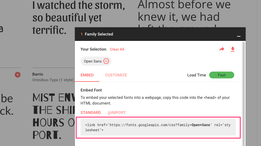
In Google Fonts copy the <link> tag that will make your font work:
Make a new HTML document (with the correct markup) and add some text and a heading.
Now using CSS, style the heading or the paragraph text (or even the whole body) of your page with this font. It's pretty easy.
In my Example I chose 'Open Sans'.
Therefore I include the following link in my ``:
<link href="https://fonts.googleapis.com/css?family=Open+Sans" rel="stylesheet">Now I write the following CSS:
h1, h2, h3, h4, h5, h6 {
  font-family: "Open Sans", Helvetica, Arial, sans-serif;
}
Notice that I included a fall-back font, in case for whatever reason the Open Sans isn't available.
Now try this with any font you link. You can even select multiple fonts in Google Fonts and try with both!
Applying a font face
By now you've probably worked out that the CSS property to change the font of different text is font-family, followed by a comma-separated list of fonts going from the one we want the most, to the fall-back and then the default at the end.
Font properties
In addition to changing the Font itself, we can apply different properties to the font, notably :
-
Change the font weight (bold, normal, light) with:
font-weight, which takes the values100,200,300,400,500,600,700. You can also useboldas a shortcut for700andnormalas a shortcut for400. -
Change the font-size (the size of the text) using
font-sizewhich takes a size in any supported CSS unit (in our previous examples we usedpxfor pixels. We'll look at the other units a bit further on in this class). -
Change the font style (italic or not) with the property
font-stylewhich takes eitheritalicornormal(and some other properties but let's not worry about those.
Without trying it out, can you tell what the code below will do?
h1 {
  font-family: Helvetica, Arial, sans-serif;
  font-weight: bold;
  font-style: italic;
  font-size: 30px;
}
Now try it out in your HTML file.
- How would I change the text from bold to normal?
- How would I change the size to 20 pixels?
Color
We also saw in the previous part that we can use the property color to change the color of the text of different elements.
Note that color changes text color whereas background-color will change the color of the background of a block element.
To make the text of all our titles red, we can use the rule :
h1, h2, h3, h4, h5, h6 {
  color:  red;
}
We can use the names of some colors like this in CSS. Check out this table for a full list of color names that CSS supports.
However, these colors only represent 140 of the thousands of colors we can describe in HTML.
Using Hex values to describe colors
Another way of describing colors in CSS and HTML is to use Hex values.
h1, h2, h3, h4, h5, h6 {
  color: #f65a44;
}
This hex value: #F65A44 represents a nice orange-y color.
The Hex code always starts with a # and is always composed of 6 hexadecimal digits. Each pair of 2 digits represents an amount of red, green and blue, and each digit can go from 0->9 and then from A->F. Thus, #FFFFFF is pure white (each color red, green and blue is at 100%), #000000 is pure black, #FF0000 is pure red (Red is 100%, other colors 0% etc.)
You don't need to know too much about how this works, but if you've interested, check out: How Hexadecimal colors work.
Using RGB values to describe colors
We can also use straight RGB values to describe colors in CSS.
h1, h2, h3, h4, h5, h6 {
  color: rgb(246, 90, 68);
}
This is strictly the same as the previous hex color (go ahead, try it!). In this case, we start with the keyword rgb in CSS, and then within the brackets we put the values for red, green and blue respectively.
Using RGBA values to describe colors with transparency.
In the later versions of the CSS3 specification, we can also use rgba notation to describe a color and a degree of transparency (or opacity).
rgba stands for red, green, blue, alpha. Alpha is the channel in Graphic Processing used to describe transparency. An alpha value of 0 is entirely transparent (i.e. invisible), an alpha value of 1 is entirely opaque.
Can you work out what the following rgba code means?
h1, h2, h3, h4, h5, h6 {
  color: rgba(246, 90, 68, 0.7);
}
Other text properties
We can also use properties to describe text alignment, letter and line spacing, line height, and a number of other properties:
text-aligntakesleft,center,rightandjustify.line-heighttakes a number value (1 = same height as text)text-shadowallows us to apply shadows to our text. Check out the specification here.
Copy the following text:
The best taco bowls are made in Trump Tower Grill. I love Hispanics! He’s not a word hero. He’s a word hero because he was captured. I like text that wasn’t captured. You have so many different things placeholder text has to be able to do, and I don't believe Lorem Ipsum has the stamina. He’s not a word hero. He’s a word hero because he was captured. I like text that wasn’t captured.

When other websites give you text, they’re not sending the best. They’re not sending you, they’re sending words that have lots of problems and they’re bringing those problems with us. They’re bringing mistakes. They’re bringing misspellings. They’re typists… And some, I assume, are good words. You’re disgusting. If Trump Ipsum weren’t my own words, perhaps I’d be dating it.

Some people have an ability to write placeholder text... It's an art you're basically born with. You either have it or you don't. Trump Ipsum is calling for a total and complete shutdown of Muslim text entering your website.

Some people have an ability to write placeholder text... It's an art you're basically born with. You either have it or you don't. Be careful, or I will spill the beans on your placeholder text.
Apply HTML paragraphs and give your text a heading.
Try out different text-align values, different line-heights, and different text-shadows to see the effect it has.
Media Queries: Different Layout on Different Screen Sizes
In this chapter, we're going to learn how to create different layouts for different screen sizes. You know how when you're on your phone on some older websites, everything looks small and you have to zoom in to read anything? Well, with media queries, we can prevent that from happening and make sure your website looks great on any device.
We'll be using flexbox to make the process a breeze and by the end of this chapter, you'll be a pro at creating responsive designs. So, buckle up and let's get started!
Media Queries
Media Queries in CSS allow you to apply different styles to your website based on the screen size and resolution of the device viewing it. This is especially useful when designing for different screen sizes, such as mobile devices, tablets, and desktop computers.
Media Queries are a CSS feature that allow you to apply different styles to your website based on the screen size and resolution of the device viewing it. They work by using a set of CSS rules to apply styles when certain conditions are met. For example, you can use a media query to change the font size when the screen width is less than 600px.
To create a Media Query, you use the @media rule followed by a condition in parentheses. The condition is usually the minimum or maximum width or height of the viewport. For example, the following media query will apply the styles inside it when the screen width is at least 600px:
@media (min-width: 600px) {
    /* Styles go here */
}
Here's an example of how you can use media queries and flexbox to create a mobile-friendly layout:
<div id="container">
  <div class="column"></div>
  <div class="column"></div>
</div>
#container {
display: flex;
flex-wrap: nowrap;
flex-direction: column;
}
.column {
width: 100%;
}
@media (min-width: 600px) {
#container {
flex-wrap: wrap;
flex-direction: row;
}
.column {
width: 50%;
}
}In this example, the container div is set to display: flex, flex-wrap: nowrap, and flex-direction: column by default. This means that the columns will be arranged in a vertical stack and will not wrap to the next line. However, when the screen width is at least 600px, the media query will apply the styles inside it and the container div will be changed to flex-wrap: wrap and flex-direction: row. This makes the columns arranged in a horizontal row and each column will take up 50% of the width.
As you can see, using media queries and flexbox together makes it easy to create responsive designs that adapt to different screen sizes. You can use media queries to adjust the layout of your website based on the screen size and resolution of the device, and use flexbox to create flexible and responsive grid-based layouts.
Mobile First
One popular approach when designing with media queries is the "mobile-first" approach. This means that the default styles are designed for smaller screens such as mobile devices, and then media queries are used to adjust the layout for larger screens such as desktops. This approach allows for a more efficient use of code and better performance on smaller devices.
For example, using flexbox for a mobile-first layout, the default styles for a two-column layout would be set as follows:
#container {
    display: flex;
    flex-wrap: nowrap;
    flex-direction: column;
}

.column {
    width: 100%;
}
Then, using media queries, the layout can be adjusted for larger screens:
@media (min-width: 600px) {
    #container {
        flex-wrap: wrap;
        flex-direction: row;
    }
    .column {
        width: 50%;
    }
}
This media query will apply the styles inside it only when the screen width is at least 600px, making the container div a row layout and each column will take up 50% of the width, giving you the traditional two-column layout that is more suitable for larger screens.
Another example of using flexbox with media queries is creating a responsive navigation menu. For mobile screens, the menu can be hidden and a button can be used to toggle it open. Using media queries, the navigation menu can be shown as a horizontal list on larger screens.
#nav {
    display: none;
}

@media (min-width: 600px) {
    #nav {
        display: flex;
        flex-direction: row;
    }
}
In this example, the #nav element is set to display:none by default and will not be visible on mobile screens. However, when the screen width is at least 600px, the media query will apply the styles inside it and the #nav element will be displayed as a horizontal list using flex-direction: row;
CSS Units
The last thing we're going to cover in our basic class is units.
We've already seen some units in CSS:
pxwhich is equivalent to pixels%which is equivalent to percentage of the parent element
But let's add a few more one's you'll probably see:
emrem
em
em is a funny unit. It is equivalent to the size of the current font-size at the place where it is used.
So if we have in the body of our document a paragraph and we set the size to 1.2em, our text will be 1.2x the size of the body font-size.
If we do the same thing on an h1 though, it will be 1.5x the size of the h1 font size.
This can be useful when we're designing buttons for example, where we want the padding and margins to be proportional to the overall size of the button. If we design the whole button using em, we can just increase the font size and all the dimensions of the button will increase.
<a href="#" class="button">Button!</a>.button {
display: inline-block;
padding: 0.5em 1.5em;
background-color: gray;
}Try increasing the font-size of the button with CSS. What happens to the padding?
rem
rem stands for relative em. A relative EM is basically the em unit, but without all of the funky 'changing-with-the-current-font-size' functionality. It basically is like em but it is always relative to the body font-size. So wherever you use it, 1rem is 1x the current body font-size.
Exercises
Ungraded Exercise : Exercise 1
This is an ungraded exercise for practice only, you don't need to submit it for grading
Copy the given HTML into a new document and submit it like last time.
- Do exercises 1-5 from the w3 schools font section
Ungraded Exercise : Exercise 2
This is an ungraded exercise for practice only, you don't need to submit it for grading
Take your CV markup from Lesson 1.
-
Apply a different font for the headings (use a Google font)
-
Apply a different font for the body text.
-
Change the color of the headings
-
Add a border to your photo and your contact information. The border color should be a Hex color.
-
Use the paddings and margin to make the spacing on your CV more interesting.
Ungraded Exercise : Exercise 3 (Flexbox)
This is an ungraded exercise for practice only, you don't need to submit it for grading
-
Create a new HTML file and add a div element with an id of "container" and several div elements inside with a class of "item". Give each of the inner divs a unique id.
<div id="container"> <div class="item" id="item-1"></div> <div class="item" id="item-2"></div> <div class="item" id="item-3"></div> <div class="item" id="item-4"></div> </div> -
In your CSS file, set the display property of the container div to flex.
#container { display: flex; } -
Set the flex direction of the container div to column.
#container { flex-direction: column; } -
Set the flex-wrap property to wrap so that items will wrap to the next line if there isn't enough space.
#container { flex-wrap: wrap; } -
Set the justify-content property to center so that items will be aligned in the center of the container.
#container { justify-content: center; } -
Set the align-items property to center so that items will be aligned in the center of the container.
#container { align-items: center; } -
Set the width and height of each of the inner divs to 50px and give them a different background color.
.item { width: 50px; height: 50px; } #item-1 { background-color: blue; } #item-2 { background-color: red; } #item-3 { background-color: green; } #item-4 { background-color: yellow; } -
Now, run the HTML file in your browser and observe the layout of the items. They should be arranged in a column and aligned in the center of the container.
-
Now, change the flex-direction property of the container div to row and refresh the browser. Observe the layout of the items. They should be arranged in a row and aligned in the center of the container.
-
Now, set the flex-wrap property to nowrap and refresh the browser. Observe the layout of the items. They should not wrap to the next line and they should be aligned in the center of the container.
-
Now, set the justify-content property to flex-start and refresh the browser. Observe the layout of the items. They should be aligned to the start of the container.
-
Now, set the align-items property to flex-end and refresh the browser. Observe the layout of the items. They should be aligned to the end of the container.
Ungraded Exercise : Exercise 4 (Two-Column Layout)
This is an ungraded exercise for practice only, you don't need to submit it for grading
Creating a two-column layout with Flexbox is a simple and efficient way to organize your content. Here is a step-by-step tutorial on how to create a two-column layout using Flexbox:
- Start by creating a new HTML file and adding a div element with an id of "container". Inside the container div, add two div elements with a class of "column". Give each of the column divs a unique id.
<div id="container">
    <div class="column" id="column-1"></div>
    <div class="column" id="column-2"></div>
</div>- In your CSS file, set the display property of the container div to flex.
#container {
    display: flex;
}- Set the flex-wrap property to nowrap so that the columns will not wrap to the next line.
#container {
    flex-wrap: nowrap;
}- Set the flex-direction property to row so that the columns will be arranged horizontally.
#container {
    flex-direction: row;
}- Set the width of each column to 50% so that they will take up equal space in the container.
.column {
    width: 50%;
}- Add some content to each of the column divs, such as text or images.
<div id="container">
    <div class="column" id="column-1">
        <p>Column 1 Content</p>
    </div>
    <div class="column" id="column-2">
        <p>Column 2 Content</p>
    </div>
</div>
Now, run the HTML file in your browser and observe the layout of the columns. They should be arranged horizontally and take up equal space in the container.
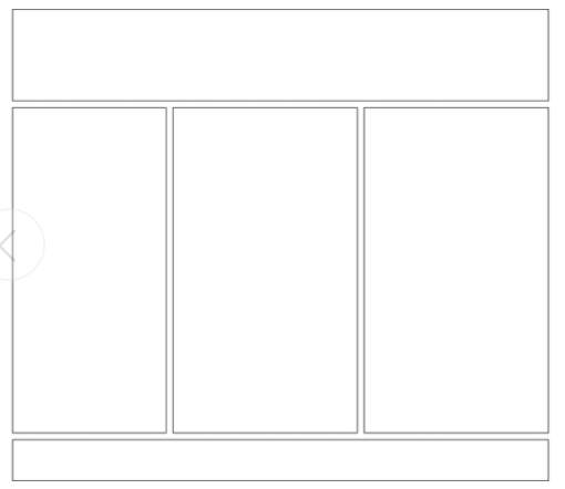
-
Now adjust your code so that you produce a 3 column layout (as below). Add a header element also as you see below, and add some content inside it.
-
Add a footer element below your flexbox container.
Ungraded Exercise : Exercise 5 (Mini Website)
This is an ungraded exercise for practice only, you don't need to submit it for grading
Take the mini website you made in Lesson 1.
-
Use CSS to lay out the navigation menu as 4 buttons from left to right (in a horizontal line). The buttons should be square, have a background color, and should go from left to right in the correct order.
-
Apply the layout you made in exercise 4 to your website. Give your website some nice background-colors, link colors, fonts and use padding and margin to lay it out nicely.
Be as creative as you wish with this part.